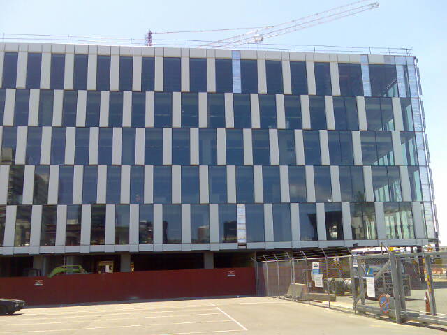
At the far end of the waterfront promenade from the recently opened oHtel, lies the newest addition to the waterfront: the BNZ ‘groundscraper’. It’s a big building that must treat its bulk carefully, but fortunately what is emerging from the scaffolding seems much more interesting than what the first renders gave it credit for. The architects have clearly delved deep into their bag of tricks to disguise some of the mass, but is this effect that Jasmax were planning for, or just a curious by-product?
I’m talking of course about the south elevation that stands close to the stern of the BlueBridge Ferry. There is a curious grid pattern across the façade that splays out, seeming to flicker up and down – much like a moiré pattern or one of those fresnels of a winking Jesus. I think its caused by the gradual widening of the window spacing – the closer you sit to the sea, the more window view you get, whereas if you sit close to the city, your window gets reduced to a much slimmer slot. No guesses as to where the boss will be sitting.
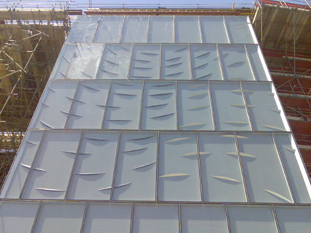
The panels also tilt from side to side in an effort to break up the façade, but it is at the round the corner on the west side that the pattern really starts to get cutting. In an area facing the road that looks like a good position for some lifts and toilets, there is a curious series of artistically ripped panels, all ripped immaculately with a fine swoop. Is this an oblique reference to having a slash? Surely not.
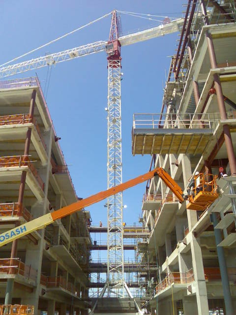
But this building has more exciting things in store for us than just crazy mind-altering patterns. In order to break up the bulk and distribute air and daylight to the lucky worker bees inside, the building consists of 3 large wings separated by 2 spacious atriums. One of these appears to sit up at first floor level, so I guess that’s not for us (the public), but the other appears to be level and accessible from ground level along the Quay. Small balconies project out into it, and the occasional bridge spans the divide, but largely it appears to be one glorious large enclosed space. Even better, the word from the Ears of the Fish is that this atrium should be a publicly accessible space – if not 24/7 – then at least during working hours.
It’s a strange fact of life; Wellington is certainly known for the occasional small blow, there is no major space that is sheltered from the elements. In other windy cities like Chicago there are malls aplenty, and huge atriums are common feature in commercial buildings. But in Wellington we are sadly lacking in large, sheltered public spaces. Perhaps this building will fit the bill, and could also make a great place for exhibitions and functions. Lets hope this space is for hire.




So, it seems, finally architecture is reduced to pattern-making on structures designed by engineers?
No, i wouldn’t say that at all. The whole form of the building is a hugely architectural exercise, with the 3 wings and sky bridges and so on. Although, ironically, the parameters for many of the architectural elements is now set by the Green Building Council recommendations – ie opening windows, limit of distance from daylight, low height so that stairs can be used in preference to lifts etc. So it depends how ‘deep’ you say the architecture is. Is it indeed just skin deep, or does it permeate the whole complex? I say its the latter.
Engineers and regulatory bodies then ;)
There is a building in Melbourne’s Docklands that does the black and white panels thing, and it messes with your eyes and perspective in a similar way.
It’s about the same sized building too. Maybe there is a bit of architectural cutting and pasting going on?
The Docklands building
I also remember having seen that Melbourne building around, it certainly uses the illusion (Munsterberg effect) to a much greater effect. As well as in the façade, it continues it as a motif throughout the interior (looks pretty crazy). Its also boasts some impressive eco-cred, which I dont think the BNZ development can compete with. However it doesn’t seem to engage with the surround area much
If anyone was interested, its by the same firm that did the National Museum of Australia. This is the building that managed to claim 1st place over Te Papa in the most-controversial-national-museum awards.
Actually I lie, the BNZ is being design to match “the best Greenstar possible”, so good things could happen yet. Also:
“This new building will represent
everything that’s good about Harbour
Quays,” added Mr Gould. “It will be
modern and state-of-the-art, feature a
large floor plate and blend in well with
the surrounding environment. The office
accommodation will be complemented
with ground floor retail. The type of space
we will create for BNZ is not currently
available anywhere else in the city.”
@Maximus:
Making buildings low to promote stair use over lifts? That sounds more like a cynical justification for sprawling, low-slung office parks than a genuine green-building strategy. Surely the energy saved by not having to move people vertically is dwarfed by the energy required to move all those people so much further horizontally!
[…] city-side façades. Site 10 adopts a fenestration patterning similar to that used by the near-by BNZ waterfront project, but breaks the mould by adding a curious glass volume on the North-East side. This glass box seems […]
[…] and hog so much foreshore, for sure, and that the relentless telescoping checker pattern facade doesn’t really work as a visual illusion, instead acting more as a giant white snake shedding its skin: but this is a building that offers a […]
There is a building in Melbourne's Docklands that does the black and white panels thing, and it messes with your eyes and perspective in a similar way.
It's about the same sized building too. Maybe there is a bit of architectural cutting and pasting going on?