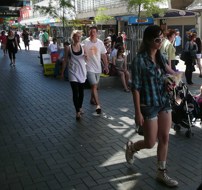
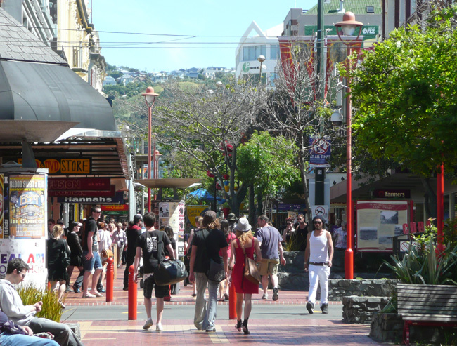
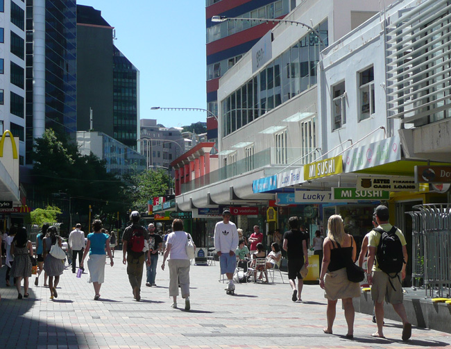
So I was thinking to myself, as you do on a fine summer’s day like today: what is it that makes Cuba St so special, whereas Manners Mall just doesn’t cut the mustard?
Is it the paving? Grey bricks just aren’t as warm and friendly as the orange hues of Cuba. Is it the architecture? Cuba’s sure is older, while Manners is newer: but is that all there is?
Is it the people? Surely not – its often the same people in both spaces.
Is it the shops? It’s noticeable that the fast food barns congregate on the corners of Manners Mall, whereas its the fine food of Matterhorn that coagulates the centre of Cuba St.
Is it the buskers? Harp-lady and violin boys stick to Cuba, while the guitar men and mariachi-singer are happy to play in either space.
Is it the tuatara that happily waits for you to climb on its back, or is it the Bucket Fountain that is resplendent in new paint?
What about the height of the buildings – is it that 2 stories in Cuba makes all the difference in friendliness, while the 10 storey towers of Manners are alienating?
Or is it the trees and the foliage of Cuba that flips your skirt up, and the bareness of Manners leaves you feeling exposed?

We here at the Eye of the Fish have a few favourite theories about what makes it work: splishy splashy water always helps a fish find its feet. But it may be different for you.
What then, are the 101 things that make Cuba St so good for you?


Manners Mall is a bit pointless. The only reason to go there is because you want to be some place out the other side. There isn’t actually anything in the Mall worth stopping at.
I’m glad to hear the Bucket Fountain is back. It was sitting across the road from my place for a while getting worked on. Then it just disappeared for a while… maybe taken inside the workshop rather than being worked on in the car park, perhaps?
Cuba Mall is full of lots of interesting things that fill up the space between the shops – seats, Bucket Fountain, the little stage area, the playground, trees – whereas Manners Mall is a giant open space with only a few seating areas thrown in.
The stuff in the middle of Cuba Mall means you have to walk along the edges, in the traditional footpath spaces. But Manners Mall has space in the middle, and most people seem to walk through the open middle of it, away from the shops.
The emptiness of Manners makes it feel more like a really wide footpath, a superhighway for pedestrians. Cuba Mall welcomes people to sit down and enjoy the street. Manners Mall hurries you along.
Also, today Yulia was doing a live performance in Cuba Mall. You wouldn’t see that in Manners.
Cuba has a boutique quirkiness and maybe that has somethign to do with the age and height of the buildings but also the variety of content. Manners is ho hum city – and souless. The plan of putting the bus route back through Manners makes more sense to me. I am moving South soon and I will REALLY miss Cuba Street but won’t give a 2nd thought to Manners Mall.
Manners mall has low quality shops and is surrounded by characterless buildings and shop frontages. Also there is minimal outdoor dining whereas upper cuba has cafes sprawling onto the pavement. Manners mall could easily be reinvented as a high-class top end precinct with the right shops and street furniture, something like that street adjacent to queen street in auckland which has shops like industrie,workshop and world.
“whereas its the fine food of Matterhorn that coagulates the centre of Cuba St.” – don’t you mean Mr. Bun?
It is the design of Manners Mall – to discourage groups from lingering – the very opposite of Cuba Mall. I don’t think the architecture plays a direct role as such. The right mix of tenants will follow the activity – the current mish mash just highlights the inadequacies of the mall as an urban space…
Your pictures say it all. Cuba has trees all the way through, while Manners only really has trees in the distance, where the buses run. The trees that WCC have planted (Gingko biloba) in the steel seating cages are a lovely tree once they get going, but seem a little too fragile for the area, with several of them looking as though they have been chewed by beavers, so mangled are their stumps. If the WCC were to bring traffic through Manners Mall once more, they may want to chose trees that are larger and more sturdy to begin with.
The great thing about the trees of course, is that they bring birdlife into the street, such as sparrows, rather than just those horrid pigeons who seem to prefer the wider open spaces such as the Mall.
” I don’t think the architecture plays a direct role as such.” M-D : you may be right. But can you name me one area of popular outdoor dining, surrounded by completely modern buildings? I’m sure there must be at least one. Somewhere. But: Auckland’s outdoor dining area is Vulcan Lane and High St, replete with small scale older buildings. Christchurch’s outdoor eating area? Not the Cathedral Square with its hideous Warren and Mahoney 1980s PoMo atrocities (I’m not sure where they do sit out, mind you – perhaps its not the done thing in Christchurch). Naenae? now there’s a completely modern precinct – but devoid of all signs of life.
I second what Robyn said. Cuba Mall is a little maze of nooks, and planters, and trees, and furniture, and stages, and splashy fountains, and so forth that creates individual little spaces to walk through, or sit in, that are more intimate.
Manners Mall is just bleak.
As for outdoor eating, Cuba Mall doesn’t really have that much. In fact, on sunny days I wish it had much more. There’s the bars at the top (bursting with smokers), Plum, the Mr Bun, some take away kebab, what am I missing?
Left Bank is an outdoor eating area completely surrounded by modern buildings. But in general it doesn’t happen. Perhaps because areas surrounded by modern buildings were never really designed for people?
Indeed, Yulia was singing yesterday, I saw her too. Looking and sounding gorgeous, but in a sort of pinky red Barbie-meets-Bondage bodice with lots of lacing up the back. Should have been deeply wonderful, but with her voice its just wrong.
Anyway, yes: clothing on Cuba.
Gets. Me. Every. Time.
and it has to be said: tattoos.
Is there anywhere else with such a fine range and full extent on tattoos as Cuba Mall on a sunny day?
I’m sitting here on a Sunday afternoon listening to a seriously good electric guitar player – a fantastic rendition of Sweet Child of Mine – and it sounds like its coming from Manners, not Cuba. Clearly more reverb from the concrete canyon.
I walked down the bit of Lower Cuba Street today – from Manners to Wakefield. It’s a curious street. The west side feels very Manners Mall, a continuation of the youth-oriented businesses. The east side has more of the boho Cuba Mall feel, especially with the James Smith building shops. And then the north end goes in a totally new direction, starting to get all posh on both sides of the street.
But it’s interesting that even though the west side has similar shops to its round-the-corner neighbour, it still manages to feel much more pleasant than Manners Mall.
Robyn>especially with the James Smith building shops
Next to JS is probably Wellington’s ugliest building… The one with the dull gray panels and no detailing what so ever. I think there is a gym in the building. Horrible!
Sorry to tell you this David P : but the building you speak of has a fantastic roofscape and so is actually one of the best buildings in Wellington! I agree it puts up a bad front to the street – but if you go up to the roof of the BNZ (the “Renaissance” apartments) you can see over the parapet to a modernist wonderland of glazed atria and roofgarden….. its like Mies had dies and gone to heaven in lower Cuba St.
M-D : you may be right. But can you name me one area of popular outdoor dining, surrounded by completely modern buildings?
Kumutoto? Any number of restaurants/cafes that spill out onto the street down Courtenay? Midland Park?
I reckon it is the architecture of the space itself, rather than just its wrapping (or the facades that front it, which are almost irrelevant… Kumutoto is is one of the few examples of a successfully space that is mostly the result of the building that defines it…
M-D : you may be `right. But can you name me one area of popular outdoor dining, surrounded by completely modern buildings?
Kumutoto? Any number of restaurants/cafes that spill out onto the street down Courtenay? Midland Park?
I reckon it is the architecture of the space itself, rather than just its wrapping (or the facades that front it, which are almost irrelevant… Kumutoto is is one of the few examples of a successfully space that is mostly the result of the building that defines it…
oops, sorry for the double post…
.
.
.
.
oops, sorry for the double post…
Aaah, yes, but then Kumutoto is not solely surrounded by modern architecture. Granted that the new Meridian building provides 2 sides (ie Waga and Mojo), but then there is also Sheds 11 and 13 providing another backdrop (2-3 stories high, even if it is just one story high), and even the old Greta Point Tavern / whatever it is called now building on the south side.
– And speaking of the space on the south side – given that Eon Design store in Auckland has just gone belly up (in the paper in the weekend), then it would seem unlikely to be coming down and opening a branch up down here in Shelbyville.
So: room for another bar on the waterfront?
I was referring to the Waga/Mojo area as the popular outdoor dining spaces – there is of course the shed to the west, but that only has a minimal impact on the space – and being inactive, isn’t really even a positive impact, apart from its role as edge definition (albeit, across the road) – which lets face it – any old (or new) wall could provide… I think you’d be nit-picking to dismiss this as a successful contemporary example (and one of the best purpose-designed such space of any period in the city).
I should also have thrown in Chaffers Boathouse apartments, where it meets the waterfront, as another example of a popular outdoor dining space…
Having lived on Cuba and Left Bank, I have to say that both could be much ‘nicer’. Manners is a bit of a wind tunnel, and I have to say, the massive ANZ notwithstanding, I really do like the tree lined Manners Street Nth section.
I read a great book in the Wellington Public Library (to which I can no longer go until I have paid off about $90 worth of fines!!!) about Great Streets (possibly called Great Streets), and it listed a few criteria, one of which was the termination. Taranaki St doesn’t work for a lot of reasons, one of which is it just sort of peters out like a sewage outlet onto sand.
Think of the generally accepted ‘good’ streets in Wellington:
Cuba – terminates at two dramatic buildings, three really: That apartment block, which is ugly but interesting, and somewhat imposing; and the lane between Town Hall and Michael Fowler.
Manners nth – terminates at three great buildings at the nth/west end: the Church, St George, and Majestic Center, and then an imposing hill. Looking the other way, Manners doesn’t have nearly the same appeal.
Mercer/Wakefield Streets – ends at Willis at the building that apparently isn’t Community House, and winds, so it seems to terminate at the NZ Racing Building/Lido or Civic Square or Dominion Building.
Courtenay Place – A steep hill at the end of Dixon vs the imposing Embassy and Mt Vic.
So it’s not necessarily the architecture of the street, but how the buildings define the space. Manners is never going to work until there is some definition (not a big radio dial!). The Burger King building and the James Smiths sort of do this job, but the Oaks and the medium/low rise along the malls are the key to defining Manners. If the Oaks was five stories higher, and five or six different buildings instead of one complex, and if the McDonalds was an interesting ‘gateway corner’ type building and crucially, there were lots of trolley bus wires and poles, then Manners would be more like mid/lower Willis Street – not necessarily pleasant, but an attractive, bustling city street.
Not sure if that made much sense. I’m running out of icafe money…
“it’s not necessarily the architecture of the street, but how the buildings define the space.”
Jason, you’re absolutely right, and thanks for bringing it up. We have a copy of that book “Great Streets” by Allan B Jacobs here at the Eye of the Fish library – and it has some excellent analysis of what it takes to make a great pedestrian space.
I particularly like the way it looks at the Cross-section of the street as well – rather than just the plan – and note that Jacobs makes the point that street design and tree spacing must not be left to the traffic engineers. While they may be good at designing smooth paths for cars to travel safely at speed, when it comes to pedestrians, we actually want cars to travel slowly, and one way to do this is to make their journey feel unsafe. This appears to have been an aim with the recent Lambton Quay alterations, where the road edge ducks in and out to create bus stops and loading bays, and negates the streamlining of traffic flow – and it works.
Jacobs notes other pointers for Great Streets:
Places for People to Walk with some Leisure
Physical Comfort
Definition (ie boundaries both vertical and horizontal)
Qualities that Engage the Eyes
Transparency (a sense of what is beyond or behind)
Complementarity (do the buildings ‘get along’ with each other)
Maintenance (physical repairs)
Quality of Construction and Design
It’s arguable that there are a few of those where the ball has been dropped in the case of Manners, which may be one reason why the space feels not quite right.
The main problems with Manners Mall are:
The uniformly poor and very uninteresting, or frankly ugly, architecture of the surrounding buildings, no grace, quirkiness, age or style.
The shops generally are not that interesting.
The poor design and quality of the street furniture, seating arrangements and the trees placed to the side, inappropriately. The Manners Mall looks like a pedestrian throughway, designed to be quickly converted back to traffic, rather than something that only pedestrians or cyclists could safely navigate or better still, would wish to linger.
No shelter, Manners Mall, like DIxon and Vivian Street are some of the windiest streets in a very windy city . The architects of the mall should have understood this and placed screens, trees or booths or whatever to break up the broad sweep of the Mall to allow some repose and shelter, and a feeling of more intimate areas, this was a major lost opportunity from the start.
Having said that I’ll be sorry to see it go, sacrificed for a bus route. I am not convinced bus trips will gain more than a few seconds of time. Also there are only 356 metres of pedestrianised street in the whole central city (excluding the harbourside). Losing Manners Mall means we will only have 240 metres of Cuba Mall. I think that that is a big loss, and Wellington’s lack of pedestrianised streets is a major failing, comparing very badly with many European cities, and is a continued loss of amenity to the public.