If you want suggestions on logos, go to here… Or for more, go here…
But not here.

These are not the logos you are looking for….
Post-script:
And, while we’re on the yellow and black theme, how is this for a (subject-unrelated) note?!:

I wonder where NZ sits….?


Tres droll.
??
‘c’est très drole?
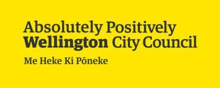
On topic, not only is that not the logo we are looking for, it is barely even worthy of being called a ‘logo’ (as in a ‘symbol’) – ceci n’est pas une logo rings so true. Don’t get me wrong, I enjoy well designed text-based logos, but at what point does a text-based logo simply become just text?! I think they might have just nailed that fine line with this ‘design’.
I can see why stuff punters have suggested they could have designed this for free.
Actually, perhaps WCC should have opened it up to a public design competition to get a broader range of ideas, and to celebrate the ‘positive’ diversity of our own citizenry?
Thanks Max – I agree this isn’t a logo, just takes the already existing set of words, a choice of type set, and a choice of background colour. The design says absolutely nothing whatsoever about Wellington that is not already said – better in my view – by the existing arrangements of the words ‘Absolutely Positively Wellington’. In a sense it takes a logo and takes the logo out of it. For me it certainly fails completely in the brief which was about ‘refreshing’ the brand.
If – big if – APW – has had its day – then surely you move away from the words too. If not – then I really cannot see how this ‘refreshes’ anything.
Is this a big issue ? No not in itself, but symbolism is always important to people. Symbols come to mean things and we identify with the ones that work. That’s why there is passion in debate about flags, anthems and so forth. The idea is something that represents not just Council but the City too.
I think you are right M-D about a competition. There are undoubtedly any number of creative ideas and creative people in the City – or the Region if we want to think about the possibility that a logo might need to work for a wider area. Undoubtedly if there is a change to local body structures then a new name/logo will be required. The question is whether to wait and see where the regional governance thing goes. If you wait – probably wise – then for me that means keeping what we already have – forget the costs of rebranding on anything, and a competition gets run at the relevant time. On the other hand it is a bit like a flag – maybe a good thing to encourage people to start putting creative thinking caps on !
Cheers
Andy
Thanks Andy and m-d
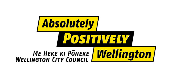
I’ve been looking again at the original APW logo (which i have coloured up in the new city “corporate” colours of yellow and black, rather than beige and off-white… and i have to say, the original logo offers some subtlety of design – as well as clarity – that the “new” all yellow (sans croix) design does not.
The colour reversal of POSITIVELY versus the lower-case Absolutely and Wellington, and the completely separate Me Heke and WCC lines, means that the three steps/lines of the logo still work well. It obviously plays (a little) on the connection to Absolutely Fabulous, thereby referencing Joanna Lumley, fashion, high class sense of design, tall hairdos, and lashings of alcohol – some of these also translate to Wellington rather well. I’ve always thought of it as the Ab Fab logo, rather than the APW logo… and indeed, sometimes start singing the theme tune to Ab Fab when i see the logo, except when it comes on a rates bill.
A curious thing today – all the spam caught in the spam filter are in French. Obviously, spem is cleverer than I had thought – it must be reacting to this post title. But then again, what does it mean that often the spam that arrives here is in another language, including sometimes Russian, Arabic or Chinese? Not so clever there Mr Spam Filter!
Back onto the subject of the logo – Clr Foster is justifiably pissed off at the ineptitude of the logo saga. It has made us look like a laughing stock – not only have ditched the perfectly adequate last logo (the 3 steps / banners), but we have also now spent money and gone backwards – we now have no logo, just a colour, or in some cases even just black on white. We also have kept the Ab Pos Well tag line even though this was arguably the most dated thing about it. The Council have spent $30-50,000 of the people’s money, got nothing but bad press and no logo, it is just a disaster all the way round. Who was responsible for this cock-up? Who was the designer? Who commissioned them? What was the brief for their work – and who signed off that either the last yellow cross logo was acceptable, or that this even more bland version would be better? Heads should roll, and this is one of those rare times that it should not be the head of Maurice Williamson, Hekia Parata, or Judith Collins. It should be a Councilor.
Or a Mayor….?