Despite the doom and gloom talk of global financial melt-down, the proposed redevelopment of our tightly packed city continues on, showing no fear (as yet), with a bullish report in the DomPost today. The latest proposal is for AMP’s redevelopment of the Gen-i building, sited on Customhouse Quay with stunning views out over the harbour.
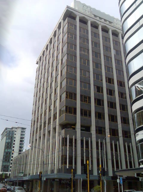
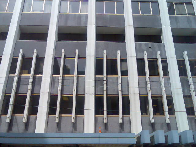
Nestling into the rear of the Maritime Tower site, and indeed wrapping around the 3 remaining quarters of the block it sits on, this tower proposal will be one of the more prominent and important developments in the City: we need major redevelopments like this so that the construction industry doesn’t hit the skids. The site has been asking for redevelopment for some time now: the current tower rises high on Featherston St but has negligible height on the eastward podium, and the tower is stitched in to the base via a form of giant concrete brise-soleil cross stitch.
The current tower (anyone know who designed it?) features a rooftop finished with a curiously crinkly, crenalated construction hiding the lift motor rooms, one of my favourites in the city, and an identical albeit possibly unintended inspiration for a much lauded house by Stevens Lawson in Auckland (allegedly no connection – but if so, how tragic that just when this building’s design has become hot again, it gets knocked down).
The architects are of course Athfield Architects, the obligatory architects de jour, de annum, and indeed de century if their design abilities are anything like their apparent party throwing abilities. So lets have a look at the design – what’s happening on the site?
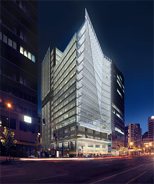
It appears that the existing building is to be razed to the ground, and recreated anew, allowing clean new floor plates and new services in place of the present 70s limpid tower, busting through the height limits (so it would seem) and surpassing the height of the Maritime House (itself 2 stories taller than permitted). Despite this, however, the building appears to be imaged not as one new tower, but instead visually broken up into 3 or more separate parts.
A 19-storey tower would front Featherston and Waring Taylor streets, a 10-storey wing would face Featherston and Ballance streets and a 15-storey wing would face Customhouse Quay. The budget for the project would be more than $90 million
.
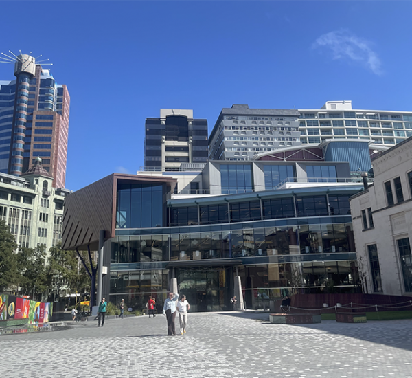
From what we’ve seen so far, the design emphasis has been put on the Customhouse Quay side, and it is there that I’m confused, ever so slightly. Or is it that the building is confused? Having gone from a fairly straightforward modernist assemblage of rectilinear block forms down the Waring Taylor side, albeit an assortment of verticals, horizontals, and glazing sailing past in a Foundation Cartier manner, the building suddenly explodes in a giant crinkle or fracture to the east.
While the architects must have been working on the scheme for months, if not years, it must still come as an intense irritation that only recently their opposition, WAM, have proposed a similar fractured facade to the proposed refurb of the National Library. While the National Library scheme appears to be driven by desires for self-justification via a populist proletarian input mechanism of flickering photoshop images and screeds of text to make it contextual, this new tower scheme has no agenda to put forward, no barrow to push: no need to break windows and cause a ruckus. No, this is just the last remaining corner of the building where rationalist thoughts can be relaxed, and permission be granted to go a little bit crazy.
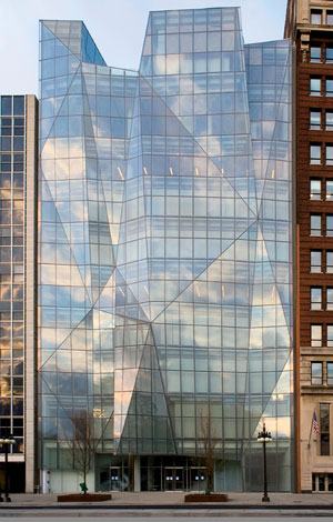
As always in architecture, nothing new really exists: this has all been done before, as evidenced by the Spertus Institute of Jewish Studies, recently opened in Chicago (another ‘windy’ city). The same fracture of the glazed facade has been attempted there by Kreuck + Sexton Architects, far more exuberantly (and no doubt far more expensively) than Athfield’s are attempting here. The design models of the Spertus are even more elucidating, showing that a far more ambitious facade was originally planned, although sadly not eventuating. Somehow – perhaps since Liebeskind has been pulling off the fractured Jewish pattern for his museums and towers, it feels like there is a lot more behind the windows of the Spertus than there is behind the walls of the AMP tower on Customhouse Quay.
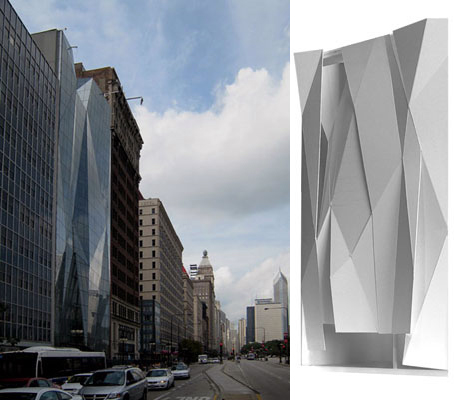
The Spertus claim that the Jewish faith is ‘multi-faceted’ – what’s the reason here? Is appropriating a form such a bad thing? Why can’t we have fun with our window cleaning? Why not?
Perhaps the better question to be asking is: Why? While we here at the Fish quite like the rumpled (stilt) skin look of the eastern facade, and the overhanging glass edge (that Athfields have done so well on Chews Lane), why do we have such a tedious assemblage of orthogonalism to the south? What if the building was fractured and fractalated all over, in a pre-“the big one”-earthquake look? Is there a rationale for swopping so quickly from between Dr Jekyl one one side to Mr Hyde on the other? If so, then it spoils the look by being able to see both sides at the same time. Or is this more like a mild-mannered Clark Kent showing a respectable pair of spectacles to the accountants on Featherston St, while rapidly spinning into his skin-tight costume on Customhouse Quay? Can we expect more whizz-bang going on behind the facade, or is beauty really only just skin-deep?



Ho-hum…
Did the much lauded house by Stevens Lawson in Auckland (Herne Bay)appear in an episode of Outragous Fortune?
Alex – Perhaps you are getting confused about the budget?
Yes, “much lauded” Herne Bay House appeared as the home of Loretta’s proposed adoption parents… twas good to see inside it. Nice fridge full of beer if I recall….
WOW! I dunno what all the whingeing is about but this certainly looks awesome. Go Wellington! you guys are lucky to be living in such a wonderful city with beautiful architecture and scenery. This is like the Oslo of the South.
Oslo of the South? What does that mean? Certainly, visually, its nothing like the Oslo in the North… Or do you mean we have an Aalto in our midst?