Perhaps we don’t need to be mean to Auckland and its architecture, as it seems to be quite good at beating itself up.
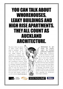
The AAA has been running a competition called Urban Eye, for a written entry on Auckland Architecture. We’re sorry we missed it. Some of the entries are so good, they could almost have been written by the Fish. But no: we’re innocent. Mind you, damn fine moderately average writing, not just for the Winning Entry (on the AAA site, and reproduced below) but also the Second and Third prize entries. Nice bit of writing getting stuck listening to your mate drunkenly ramble on about something you’ve heard them go on about a million times before.
There is, of course, some fine architecture in Auckland, to go along with their fine beaches, many islands (and Islanders), and a wonderfully convoluted motorway system, the budget of which must be the envy of many a small third world nation. And then again, there is this piece of excrement, recently erected. But the recent Auckland Architecture awards showed some excellent work in the City of Sales, as did the Wellington Architecture awards held last night in the City Gallery. According to the Arch Centre report, it was a great party, and there’s a pretty good summary of all the awards posted there. There’s even a welcome on their website to someone called Herr-Kislop or Kerr-Hislop, which sounds an unlikely name for an architect, but there you go. Sounds like those architects are all a friendly bunch in Wellington: perhaps not so much in Auckland, where at least one writer (the winner) is disgruntled, and writes frankly of Auckland, entitled:
FAILURE.
A massive all encompassing, devastating failure across the board in every way possible. That’s one way I describe Auckland, a poorly mismanaged & governed city from the very beginning and it’s still happening on a grand scale even today.
From a constant failure to invest properly in decent infrastructure, public transport, public buildings, and user friendly public facilities, let alone failing to looking after our best assets, such as the volcanic cones (most of which have been quarried from existence), the twin harbours, the beaches, lakes and natural features that abound within the Auckland region. And to top it off, the failure that is the rancid cream on the cake, are the buildings that drape themselves over Auckland like a damp mouldy blanket, rotting away at our souls and lives.
They are the truly insidious and disgusting developer driven foul leaking homes, ghetto enhancing apartment dwellings and ill conceived commercial buildings that blight our amazing landscape with their hideous forms and poorly functioning purpose. I could write volumes on how sick I feel each time I’m affronted with a new pile of shit being constructed on prime sites around Auckland.
I ask you, have you ever truly been offended by a building just by its pure ugliness and gross form, mismatched colour palate and greed hungry dollar driven templates that attempt to squeeze every last cent of rentable space out of every square metre?
Everywhere I turn, glance or sometimes, just plainly look and stare at some of the recent buildings that have been built in and around Auckland during the largest property boom this country is ever likely to see, my heart sinks because I know that yet again we’ve failed. Failed to cry outrage at the tiny apartments that force people to live like rats, failed to hold accountable, the people responsible for the thousands of leaking and sick homes that are ruining lives every day.
From the decaying Eden Quarter, to the nasty apartment blocks that blight Hobson and Nelson Streets, the Newmarket slum apartments bordering Broadway Park and let’s not forget to mention the sieve that is Sacramento in East Auckland. They are but a fraction of the thousands of homes that are claiming victims left, right & centre in Auckland. The commercial building nightmares such as the Comfort Inn in Newton Gully, the Tony Tay Building on the prime site on the corner of K Rd and Queen St, all the way to one of Auckland’s most truly grotesque forms that is the Royal Oak Mall. Have you ever been stuck in traffic at the roundabout and wondered at the surrounding hideous forms that we call building’s, that radiate out from it, like some sort of malformed ripples in a very sick stagnant pond? Does ugly form breed more ugly form around it? And, if so, how can we stop it?
 ..
.. 
I hope though, that one day soon, we can turn this tide of greed driven construction and malformed intent and start reshaping Auckland the way it should be. From the Ironbank to the Auckland University’s New School of Business, to the Civic and the Wilson School in Takapuna, all the way to looking after our beautiful beaches, unique landscapes and the environment. And hopefully along the way creating new urban spaces to enjoy our harbour waterfronts and inner city parks. These are what we should cry for, buildings that enhance our lives, workplaces and appeal to the landscape with better form, function and aesthetics that would make Auckland a city to be proud to live in, visit or just simply be a pleasure to transit through. We should be designing buildings that leave a positive impression by creating, approving and ultimately using in the way intended. Because these are buildings that we will have to use, look at, and live in for the rest of our lives should we choose to live in Auckland.
The winds of change are upon us, so I hope that we as Aucklanders will make the right decision in voting in a governing body that will take pride in Auckland and bring it forward out of the mire we find ourselves in.
Exceed expectations and excel in everything you set out to achieve, for you cannot fail if your heart is in it until the very end.



I had the misfortune of wasting multiple hours of my time writing an essay and entering this competition. All I can say is, the whole ‘competition’ was an utter shambles. I guess they had to make it representative of the architecture in discussion. The judges personally knew the winner who didnt even bother turning up to the presentation. Just a ‘big boys club’ I’d say.
The winning entry has no architectural perspective. It doesn’t talk about what makes those particular buildings good or bad.
Ok Rant over.
The winning entry is full of passion. It is also full of stylistic problems and cliche. I applaud the sentiment, but considered as an essay it is a failure.
It’s more of a diatribe. I think its fair to say that the spcifications of the competition (or lack thereof) are no better than the brief for Queens Wharf.
That essay reads like a high school English essay. It’s full of cliche and attempts at rousing rhetoric, but it doesn’t manage to say much other than “Auckland has a lot of shit building’s [sic]. But also a few that are quite good.” It doesn’t tell me anything I didn’t already know. It’s like getting stuck listening to your mate drunkenly ramble on about something you’ve heard them go on about a million times before.
The other two essays, however, are both very well written, informative and indeed a pleasure to read.
Yes, excatly. Anyone can write that! I wouldn’t be surprised if the $1000 dollars that the winner was supposed to get were shared between the organisers, with the winner being one of the organisers themseleves!!!
What I also find amazing is that there is no mention whatseover of WHO wrote the winning article. They included names for the 2nd and 3rd winners, but nothing for the 1st.
The judges had a nickname for the winner and it all seemed like they knew each other. Hmm…
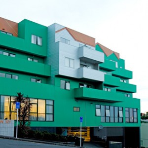
I was curious as to what the Comfort Inn in Newton Gully looks like, so I’ve added in some photos from the web. The greeen building is the Comfort Inn – mustn’t laugh, as we’ve got some equally bad plug ugly buildings here in Wellington as well. Just possibly not in that particular shade.
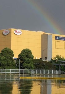
I’ve also added in 2 photos of the Royal Oak Shopping Mall, and what is sort of amazing, in this day and age where simply everything is on the web, is that virtually no images exist of the ROSM. The 2 inserted above are the only ones i could find – thanks to the original photographers on Flickr – one of the outsdie – yes, pretty bland – and one, the only one, of a girl milking a reindeer inside the Mall. I kid you not.
How very odd. All those teenagers snapping away at each other on their cellphones, and yet no images of the inside of the mall. Is the building really that completely ugly that no self-disrespecting teen has ever uploaded an image before?
If there are any Aucklanders reading (doubtful, I know, but hey, you never know) could they whip off to Royal Oak and wack off a couple of pics and email them to us? Many thanks.
Actually Maximus, thats not the Royal Oak Shopping Mall. Thats some obscure Westfield that could be literally anywhere… Royal Oak is not a Westfield.
A bit of history on Royal Oak, but unfortuneately no photos, is that it was one of the first malls built in New Zealand around the mid 80’s and prior to the crash. It was also the site of the first ever Pak N Save in the country and the developer brought them over from Aussie as a concept.
In terms of stle it reminds me of the old Copperfield that once graced Paraparaumu Beach with terracotta tiled floors. Not alot has been doen to it since then, althought the Pak N Save has just been done up whcih does give one half of it a more modern appearance.
oh bugger. Sorry. It came up as a picture on google. Interesting that no one has photographed it.
Consider myself reprimanded.
Still not sure why the girl is milking the plastic reindeer though…..
There’s always Google Streetview: http://maps.google.co.nz/maps?f=q&source=s_q&hl=en&geocode=&q=royal+oak+mall,+auckland&sll=-36.893625,174.776881&sspn=0.012613,0.027208&ie=UTF8&hq=&hnear=Oak+St,+Auckland,+1023&ll=-36.910235,174.775701&spn=0,359.972792&z=16&layer=c&cbll=-36.910488,174.775781&panoid=2q5_-uAXSehpyJe8I2YReQ&cbp=12,235.37,,0,-0.54
It’s more PoMo twiddliness than Westfield boxiness.
A typical ill considered rant you hear all the time up in Auckland. For the record:
‘…one of Auckland’s most truly grotesque forms that is the Royal Oak Mall’. This building was designed by one of NZ’s most prestigeous architectural firms, and although I won’t mention Warren and Mahoney by name, will point out that it cannot therefore be a ‘truly grotesque form’
Iron bank is a truly fantastic world class amazing awesome building, but to insinuate that Auckland should be full of them is naive. There’s approximately one developer in Auckland with the means and will to invest $50M for a lower return than they’d get in the bank – and they’ve already done it (much kudos to them).
‘…the tiny apartments that force people to live like rats’ are actualy just tiny apartments where people choose to live, some like rats and some quite tidily. Actually (with the exception Mt Eden and Paremoremo) no one in Auckland is forced to live anywhere against their will. Ironically some of the ‘tiny’ apartments on Hobson St that are constantly moaned about are actually really big – you just can’t tell from the outside. Also ironically no one seems to want to live in the 2009 NZIA award winning Stamford Plaza residences. Even more ironically the 2009 NZIA award winning Beaumont Quarter has been a complete financial disaster for it’s purchasers.
Finally, the Comfort Inn on Newton Road is a dog and the photo of it is extremely flattering.
…also if you want a photo of the Royal Oak Mall just go to http://www.warrenandmahoney.com/ – our story – chronology – 1988
“This building was designed by one of NZ’s most prestigeous architectural firms, and although I won’t mention Warren and Mahoney by name, will point out that it cannot therefore be a ‘truly grotesque form’”
All that proves is that NZ’s biggest architectural practices weren’t immune from the excesses of 1980s postmodernist frippery.
“All that proves is that NZ’s biggest architectural practices weren’t immune from the excesses of 1980s postmodernist frippery.”
Weren’t immune? ! They were the prime proponents of it! They did nothing but po-mo frippery for about 20 years! They’re only just doing some half decent buildings again now – as well as some exceedingly frippery numbers as well…..
Aaron Sills, an Auckland Architect, has this to say in the Herald This morning:
Queens Wharf: Let’s decide exactly what we want
http://www.nzherald.co.nz/building-construction/news/article.cfm?c_id=24&objectid=10609891
“When our illustrious leaders chose to pause for a cuppa, the Queens Wharf design teams were left in a state of limbo, uncertain whether they could, or should, comment publicly. There has since been much gritting of teeth among my colleagues, while politicians and members of the third and fourth estates have accused the design profession of that most heinous of crimes – being boring. The detractors have been egged on by a couple of our brethren, whose formidable talents failed to be recognised in the competition’s first stage, and who also discern a general lack of “wow” factor among the eight schemes.
Members of the design professions love to solve problems; the stickier the better. The competition brief asked how to put a cruise ship passenger terminal on the wharf, how to create great public open space and how to provide areas for events. It soon became obvious for designers that the Rugby World Cup venue requirements in themselves are not a limiting factor on the long-term shape of Queens Wharf. As many have since pointed out, it will be easy enough to throw up the marquees, tidy up a shed and install the bars. During the competition, some of the best brains in the New Zealand and overseas design industry debated the issues of city/sea linkage, the gateway quality of the site and the cruise terminal, the use and availability of public space, the on-water and aerial view of the site, potential other uses for the site, etc. There is no doubt in my mind that finalists have answered the question posed in the competition – but was it the right question?
The call by some for an iconic building is a time-honoured reaction to an empty site in a prominent city location (eg, the Wynyard Pt debate). Given the unique location of this wharf, at the bottom of Auckland’s main street, this may well be the place for a moment of bravura, but is it possible to plan for “iconic-ness”? After all, even the designer of Bilbao’s Guggenheim, Frank Gehry, has 100 other shiny buildings that don’t reach the same apogee of public recognition, and I don’t believe it is through want of trying.
Architects are often blamed for designing far more than the client can afford. With the $47 million put aside for this project, only enough to cover the stated requirements of the brief, any additional public buildings are likely to be something for the future. All the teams recognised the need for a long-term view in this context. Some chose to make the cruise terminal the dominant element of the project. Some chose to combine the public open-space function with the cruise terminal building, by creating a public rooftop ramp/walkway. Others concentrated on the provision of public open-space on the wharf, and showed the integration with a future major public building. One scheme went so far as to postulate what that major public building might be (a theatre) and showed it in place.
So, a variety of visions for the site – and three politicians charged with choosing one to go with – in the year before the amalgamation and a major election of a single Auckland mayor. Of course they went for a cup of tea! The risk of having an unfinished and unloved project hanging around their necks leading up to an election is just too great. So, where to from here? First of all, there needs to be some closure on this current process. Despite Brian Rudman’s comments about “big-name firms who couldn’t resist entering a fatally flawed competition”, there have probably been at least 500 people from all sizes of companies who have given their skills and time for this city – probably a donation of more than $2 million.
While the rest of the city may have moved on as soon as Mike Lee declared himself underwhelmed, the hundreds of people who worked on the project are aware that the enormous amount of research built up and ideas developed in the past three months should not be wasted. Eventually, when the politicians figure out how to extract themselves from ownership of the process, and the respected members of the advisory panel, including Ian Athfield and John Hunt, are allowed to speak, there should be an appraisal of what has been learned.
The competition sponsors should now be encouraged to promote a thoughtful and in-depth public discussion on the long-term use of the site. Obviously, there needs to be some work done to plan for the temporary requirements of the Rugby World Cup, and the obvious solution is to develop a new short-term brief and work with the authors of the scheme recommended by the advisory panel. A brief for the long term is a complex proposition, and cannot be resolved quickly just because of the immediate need of the Rugby World Cup. Let the new Super City or Waterfront Development Agency, public discussion and the evolving public use of the wharf inform this brief, to ensure we are asking the right questions.
Aaron Sills is an architect and director of Sills van Bohemen Architecture, and was a member of a finalist team in the Queens Wharf Design Competition.