A publicly notified consent application is a rare thing, despite what Nick Smith says. Site 10, at Kumutoto, is notified now. Rest assured, that Waterfront Watch will be objecting vociferously to this proposal, with numerous objectionable submissions being submitted.
You may also want to add your voice re the scheme. You have until Dec 18th, at 4.30pm. That’s not far away. You can read about it here: http://wellington.govt.nz/have-your-say/public-inputs/public-notices/open/north-kumutoto
In the tradition of this blog, which has provided opportunity for commentary on matters of urban design and architecture in this city for the last eight years, especially on matters pertaining to Wellington’s waterfront, here are the proposals for Site 10. A publicly notified resource consent – there are so few – deserving of feedback to the city, even if it has all been discussed so many times before. This latest, and perhaps last incarnation, is yet again another Athfield Architects design, along the line of their “competition-winning” scheme from several years ago, and a reduced height from the last scheme that was proposed, and then thrown out by the Environment Court.
Some images from the application:

The official website for the Notification of the Proposed works, has numerous files for download, with justification for all aspects of the design. There is not enough time in the world to read them all, nor enough inclination to do so, once again. I present instead some vital visual snippets from the drawings, of things that I think may be of interest.
The ground floor plan. At the north end there are small units available for rent, as a creative suite of rooms, or a suite of rooms for creatives. This must be at the insistence of, and possibly payment by the City Council – prime waterfront land, available at rentals by start-up practices with no funds? A car-ramp penetrates the middle of the rooms, arrives awkwardly in a pedestrian plaza. Is there no alternative exit space? Difficult planning decision. I suspect no other option.
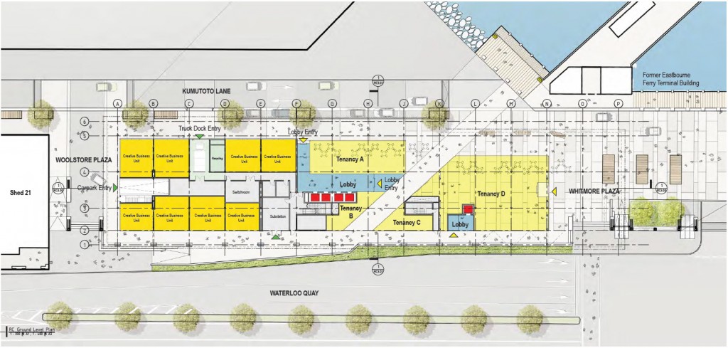
Ground floor plan
More rentable spaces surround the vertical core, probably destined for some more hospitality outlets. An angled public walkway slices through, connecting the public through from Jervois Quay direct to the waterfront. Is this a new feature to the scheme, different from last time? Lastly, another rentable space, facing south, onto the plaza at Whitmore St. This appears to be the remains of what was vaunted as a public space for the people of Wellington. There is no longer any mention of that on the drawings – instead, it is a rentable space. Do WCC plan to rent the space, on behalf of the people? Or has it simply been lost forever, an opportunity frittered away?
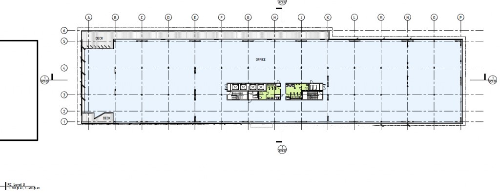
Typical plan: 3rd floor
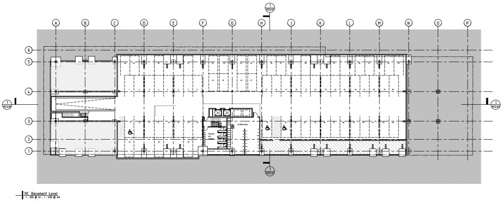
Basement plan: a ramp up/down (one way at a time?).
Perimeter parking amongst the foundation wall structure.
Some central parking and integration with the vertical circulation core.
Landscaping nearby: this proposal appears to encompass not just site 10 as a building, but also site 8, as landscape only.
Site 9 remains as a gray shadowed ghost, the subject for another Resource Consent application, a building for another day.
Site 8, nearest the sea, is a playful open space. Designed by Isthmus, not Athfield’s usual Wraight Associates partnership, the space is very different from other waterfront spaces. The ground plane crenelates, undulates, like a ruptured edge.
Timber, not flat, slopes into the sea, in order, it seems, to pull your sea-kayak out onto the sea shore. A tauranga, literally: a place to land your waka, at what is symbolically the closest actual landing point to Parliament. Possibly unlikely to be the stage for landing treaty claims, and more likely to be adventurous German tourists resting after a paddle from Fergs.
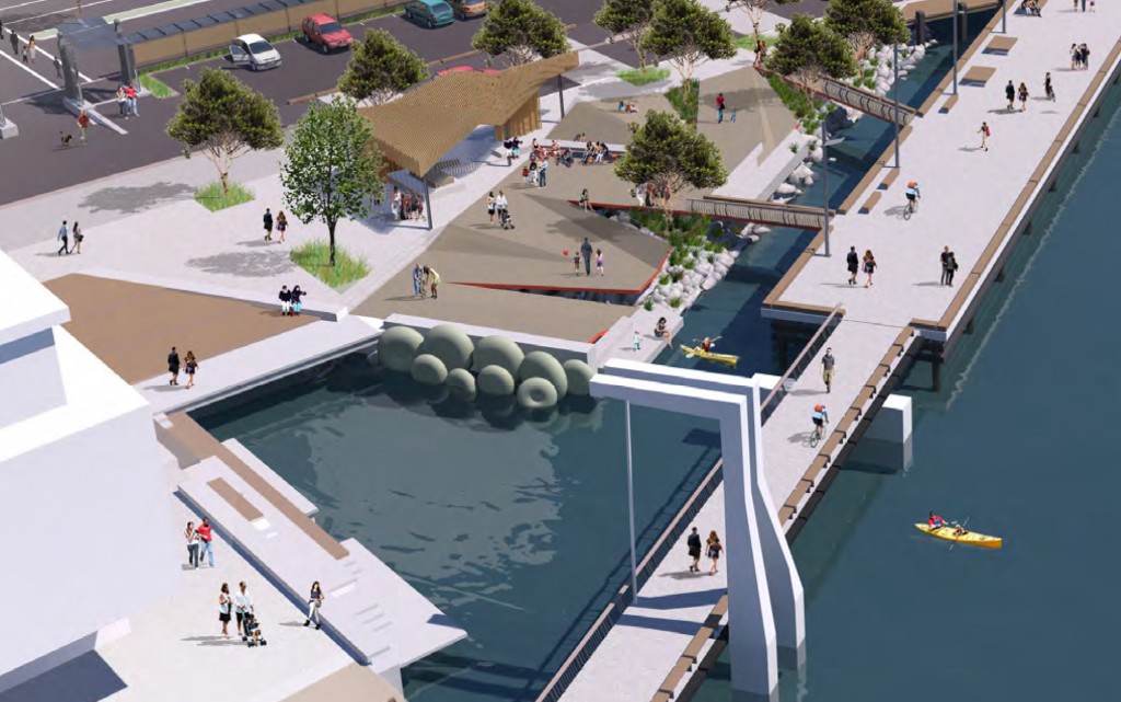
Landscaping
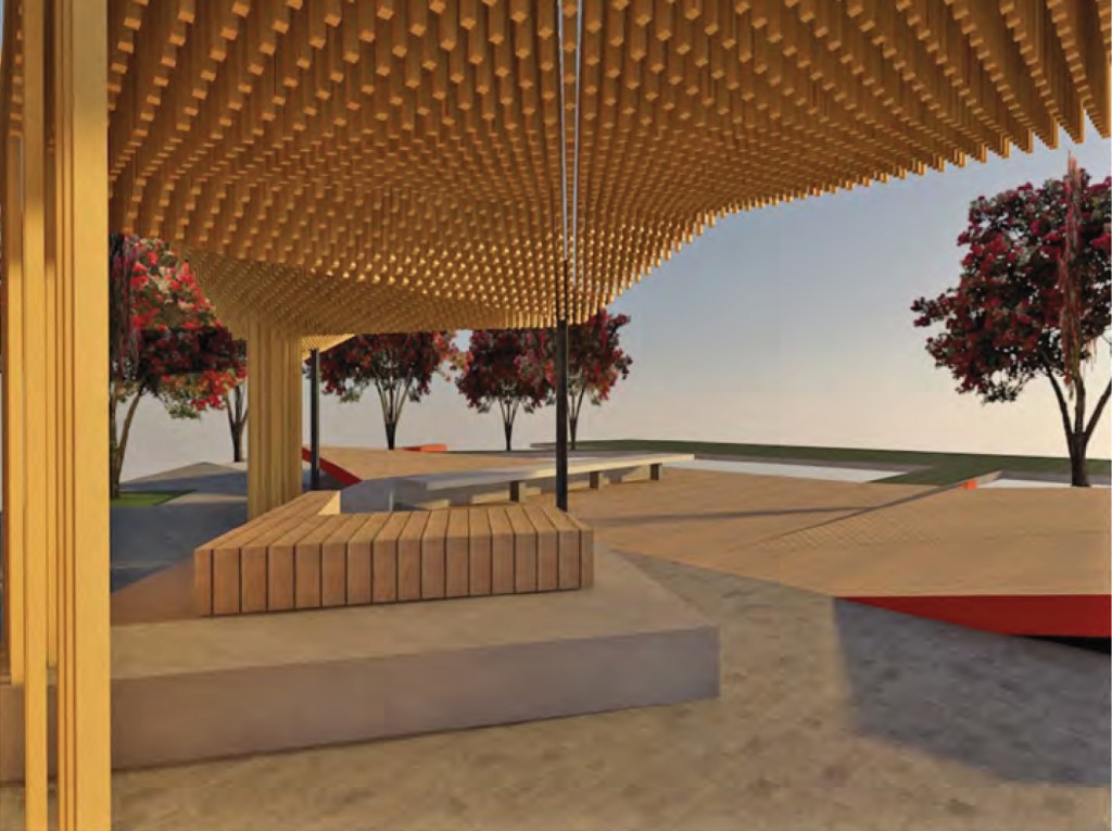
A timber, tree-like structure grows up and out of the foreshore. This is the most adventurous structure of the landscaping, with a piece of sun-shading and wind-protection on the foreshore. Numerous renderings of this are submitted, and I show here only one as a typical image. Details are sketchy – well, absent – presumably this is an open lattice of laminated timber of some form? Interesting.
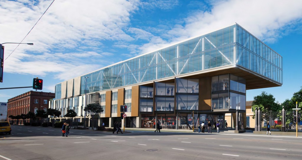
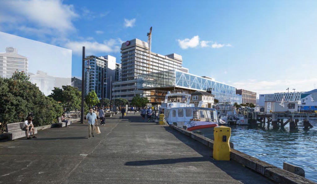
Elevations: height-wise, the building is now about the same height as the nearby brick Shed 21, but it’s appearance is very different.
Not surprisingly, the seaward elevation is all glass. Maximize that view.
On the road side, the west elevation, there are panels of solid, mixed in with the panels of glass. Appearance still sketchy.
Structurally, the top two floors cantilever forward, suspended over the public zone near Whitmore St. Structural gymnastics. Clever? Necessary?

Elevation


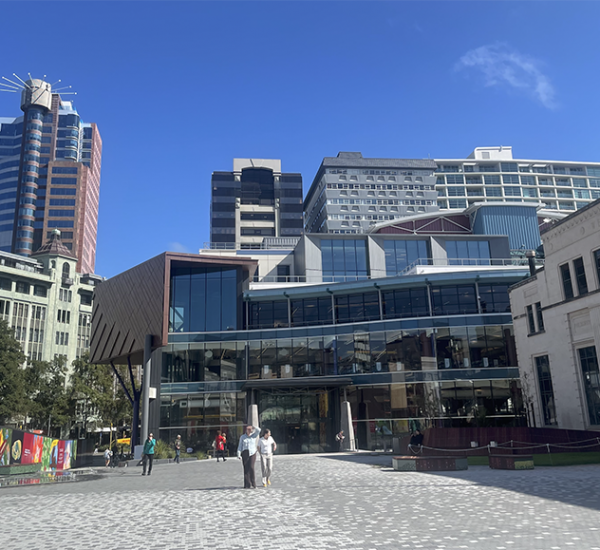

I like the wee pavilion more than the building itself and will be curious as to how it funnels the predominant Westerly through but as a gateway walkway for all those hapless cruise ship passengers who seem not to know where to go, it may prove useful
Bloody tourists.
Its a vast improvement on the campervan eyesore thats currently onsite.
What is it now? The sixth day of Christmas? And still no sign of a Cetacean in a Pear Tree…
Submissions on this Site 10 proposal have now closed. Not sure how many have been received by WCC, or when the public hearing of those will be. Hopefully the Council will inform the public of the time and date?
Mr Starkive, you want a cetacean in a pear tree? That sounds like a job for the photoshop skills of Maximus, who still appears to be on an extended tea-break. Not sure if we will be having any acts of Fish in Inappropriate Plaices this year. My apologies. I’m keen to keep this venture going though, and will relaunch it early next year. Suggestions for improvement are welcome.