The scaffold has come down and the last of the glass balustrading was going on Saturday morning – and its great to see at last what Piermont really looks like.
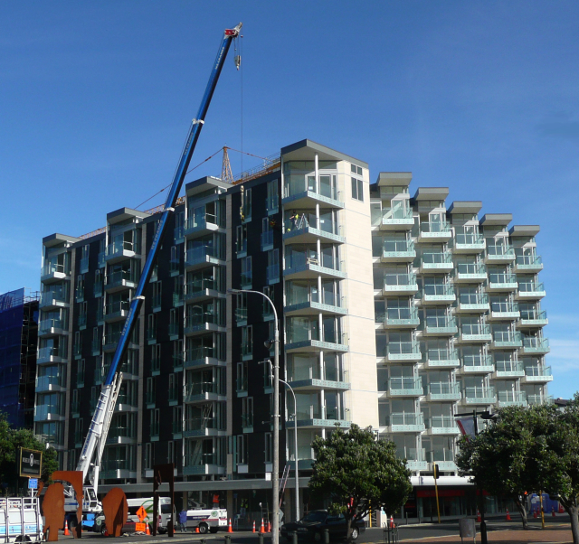
This is an apartment building that has been carefully designed for this particular corner: maximising the views out to the Waitangi Park, carefully trying to avoid seeing too much of the black hulk of the Museum Hotel, and staunchly turning its back to Portal, the other Architecture + development for CAS just up the road.
It’s always hard to comment about a building if you haven’t been inside, but until they have an open day for Fish, I’m unlikely to be able to afford an entry tag. The building has been designed with a very rigid fixation to the 45º afforded by the oblique view, and every apartment seems to have a balcony that faces out, hopefully, to the morning sun. Portal, rising flattly directly opposite from Te Papa, is competent but bland, and sadly forms an impenetrable wall onto the street. While this particular block presents a solid wall as well, the frontage is really broken down by the 45º schema, and the balconies project back and forth to give an endless play across the facade.
I’m still not sure quite what happens in the middle of the block – if there are so many balconies jostling for position along the main frontage, then presumably there are also some gasping for fresh air along the ‘back’side somewhere, possibly into a central courtyard – which I would hope there is. Mind you, this picture on the SkyScraperCity website implies that it may have a decent sized courtyard – or at least more than it looks from out the front. The Piermont website is a pointless thing, that tells you nothing except for some flowing script and the odd photo, and I have yet to find the ‘show’ apartment actually open for viewing, so its hard to tell. I like the way that websites for such things imply that the apartments concerned will be full of impeccably groomed, glossy skinned women in skimpy frocks and italianate, swarthy, impossibly young men of roughly shaven visage, while the more probable truth is that it will only be affordable to a corpulent and balding wave of bulging walleted lawyers.
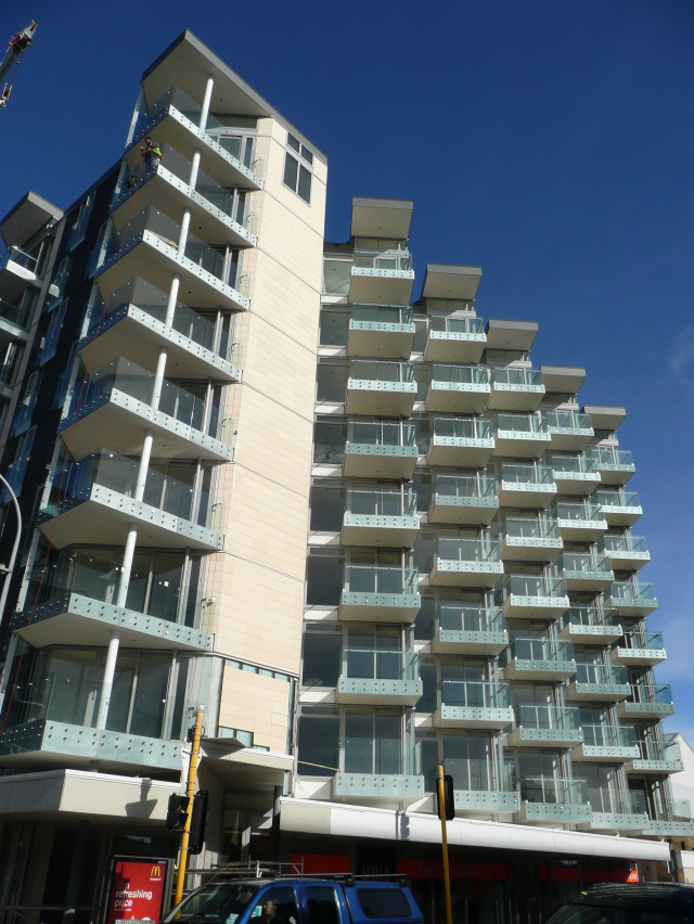
An interesting side effect that I’ve only just noticed with the scaffolding down is the accumulative effect of the balconies to the view along Cable St – especially in the morning sunshine, where the strong horizontal bands of the balconies stack up with a twisting motion. Cleverly, this all turns its back on the traffic that roars along the waterfront – hopefully, it reduces the noise somewhat as well. There’s a nice swathe of well lit retail space along the street frontage as well, which always deserved better than its previous incarnation as a giant Red Shed for the nations favourite shopping chain. Although, I suspect that this is not the kind of place where everyone gets a bargain any more. But the concatenation of the balconies and the spiralling up, in a manner similar to Calatrava’s Turning Torso Tower (although of course a static presentation only) has a good chance of continuously enlivening the facade.
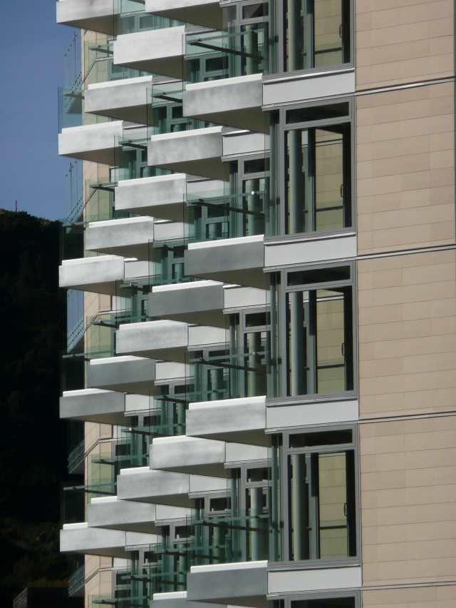
The building is clad with a very regular grid of pale clay terracotta tiles, in a similar manner to the cladding on the Te Puni student block reviewed a while back here on the Fish, and just recently in Arch NZ. It’s interesting that the same cladding is used to house both year 1 students, and the year 55+ professionals who will be packing these particular halls. Evidently, it must be a good product – curious perhaps that it hasn’t found its way onto cladding any of our thousands of boring suburban villas, of which it could presumably farewell those leaky building blues. The Tory St frontage is clad also in these tiles, but in the darker tone, more suiting its sombre relationship with the Museum Hotel and its black-coated friend, the Museum Apartments. Both of these Museum related places slightly give me the creeps with their maudlin funereal overtones (although the world’s greatest virginia creeper does give a great show across the hotel frontage in autumn).
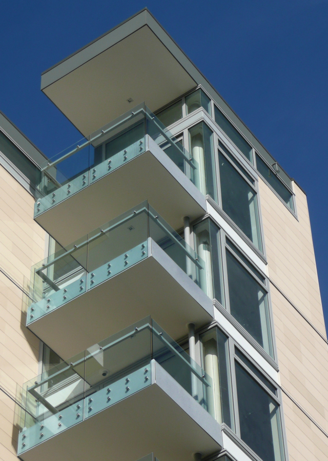
Overall then, it seems like a pretty good result from developer driven architecture + and the need for insatiable views out to sea. Yes, it could have been better if it didn’t stick so rigidly to the height limits, giving it such a sawn off top look, but sadly it seems there is a limit to how much a developer wants to attract noticification. All eyes will now be on the little neighbour to the south, as it rapidly climbs in height. Let’s save that for another day.


I tried looking for the development website for a plan of the units, but stratum has nothing on their website. It’s says their 95% sold out, so I guess marketing plans aren’t their biggest priority at this point.
I find the corner very odd, and what goes on behind that sole window at the top? It’s such a weird moment, but it’s not weird enough to be quirky and interesting, more just a wtf is that type of moment?
arg..their = they’re
You’re right about that window at the top: I hadn’t noticed that before. If it were larger or more integrated with the side window it might effectively signal the top of the building, but as it is it looks a little lost and arbitrary.
But the Cable St facade is quite surprising. I always thought from the renders that it would pretty good, but it’s so much lighter in real life, with an unexpected depth to the articulation that’s really quite delightful. Maximus is right about the blunt roofline, but there’s something in the sheer repetition of glazed elements that transforms rigour into liveliness.
hmm… I’d prefer the whole thing clad in black… not to sound too emo or anything, its just I find that pale clay colour is hideously inappropriate for Wellington. (Maybe it’s all this cold weather we’ve been having.)
I can’t believe you like this building – it’s a real dog. For the price tags advertised I would have expected some expansive areas, some decent sized balconies rather than these pokey little numbers, and not so much sameness. There’s just a grid of balconies from ground to rooftop, and even if it is at a 45 degree, so what? They’re still just too damn small to have a decent balcony party on.
The pale dead flesh tile colour is pretty pasty as well, don’t think that changing it to black would improve it at all. I guess at least its good that its not your standard glass wall box – but really, its just not that much better than the screeds of lame developer boxes in Auckland.
And not only that, we’ve got another three of these, just like it, still to come….
Rondo – have you been to Auckland recently?
This is much better than most of the dross up there. I’m not saying this is perfect, but compared to developer driven boxes in Auckland done by no-name architectural designers this is pretty good.
CAS have a history of doing pretty crappy polystyrene-clad and plastic downpiped developments and so it is good to see that they have employed a decent architect and made a commitment to quality design and materials. They seem to be slowly upping their game.
That is a strange window at the top. I wonder if it was requested by the potential owner when they bought off the plans… It seems a little… lost…. and out of place….
Rondo, my apologies – I didn’t mean to post that under your name.
It seems that the first word of my post made it into the Name field.
It was not intentional.
Let it be known that the last post should have been written under the name ‘mobsta’.
Oh…here I was picturing rondo in a fight club scene
rondo accepts the apologies of he who is known as mobsta. rondo also notes that i spell rondo with a small r, hence i knew it wasn’t me i was disagreeing with. furthermore, rondo expresses remorse with calling this building a dog.
Clearly its not a dog. Clearly, its actually quite a nice building, its just, its just that its all a little bit samey samey same. Each floor is just like the other. There’s not really much difference between top, middle and base there is there, except a tiny little bit more on top, just to cover the depth of the roof.
I’m sure its hugely improved on Auckland apartments – but then, with some of the country’s most cruddy apartments, that’s not really much of a good thing there really is it? Super-city – good grief, what a joke.
You're right about that window at the top: I hadn't noticed that before. If it were larger or more integrated with the side window it might effectively signal the top of the building, but as it is it looks a little lost and arbitrary.
But the Cable St facade is quite surprising. I always thought from the renders that it would pretty good, but it's so much lighter in real life, with an unexpected depth to the articulation that's really quite delightful. Maximus is right about the blunt roofline, but there's something in the sheer repetition of glazed elements that transforms rigour into liveliness.