Finished at last,
Finished at last,
Good God Almighty, Finished at Last!
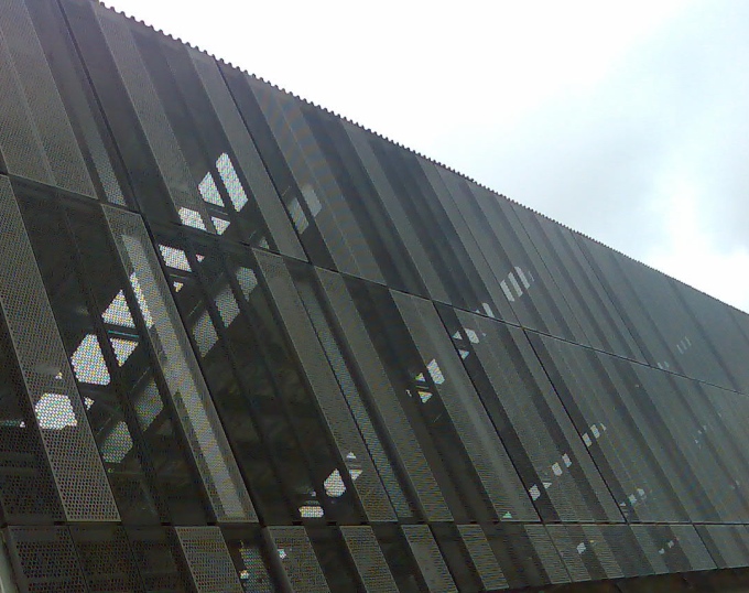
It seems like an absolute age since it was started, and who knows really if it has actually been finished, and who knows why they didn’t take the opportunity to go up another 10 floors with some rinky-dinky inner-city flats while they were there but I’m glad they didn’t, and all that aside: the Moore Wilson’s shop / empire that we all love to shop at (DavidP and Robyn, I suspect, in particular) seems to have reached a state of equilibrium at long last. It is fantastic, and gorgeous, and – well, I dunno, but still seems just as confusing as the decade it was first done in many years ago.
How do I love thee?: let me count thy ways.
Well, bogan mash-up of Rev King and big Willy aside, the obvious one is the fresh food and drink, alongside the bulk purchasing of rice and jelly-beans (no, not cooked together, but thanks for asking). But I’m not here to review the food, tempting as that may be. What about the architecture?
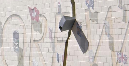
The original external facade with its monster mural of vegemite and other semi-edibles still survives – although who knows for how much longer – it is faded and looks far from its 80s best. This building was an absolute icon of Kiwi Post-Modernism when it was built – the ironic ‘crack’ in the facade, the lopsided mirror glass cube in the corner, the giant be-columned mural on the high rise part – I’m surprised this hasn’t be listed by our ever-vigilant heritage brigade at the Council as it is such an 80s classic. My, how we laughed. It was James Wine of Site and Best wrapped into one, Rob Krier and Athfield and Stanley Tigerman combined into one great unholy menage-a-trois. Despite being a good example of terrible planning (all the entry points are padlocked shut, the only entry really is by car, so whoa betide you if you’re one of those poor people on foot), it still brings a smile to my face as I walk by the mural of foodstuffs from a mostly by-gone era.
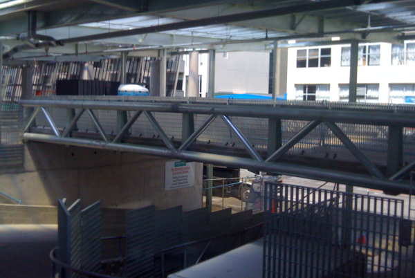
Actually, my favourite part has been partly demolished. The crazy, loopy, hump-de-hump up and over ramp has been halved – split in two like a portugese olive for sale at $5.99 a can. Instead of having what must have been the most accident-potential-prone ramp in the country where you could go left, right, up and down all in one by car or by foot (along with forklifts under and through as well), it has been emasculated and just sort of goes up and down a bit, along with a standard corkscrew round and round. Boring! However now we have new Big Fun at the top, with a bridge over th fore-mentioned ramp, and not one rooftop deck, but now three separate decks, all vaguely inter-connected. I have no idea what sort of drugs the staff at Athfields are on, but the ones doing the traffic planning are definitely on some kind of freeze-dried magic shitake mushroom ($11.40 for 200 grams).
The ground floor has been sliced and diced, hung and quartered, with everything moving around, and split asunder by cars perambulating through, but at the heart of the development now sits a splendid Paul Dibble sculpture, which makes it all well, even if you can’t find your fresh asparagus tips and the Jaegermeister has moved to aisle 22.

But of course my new favourite part is the external facade, as shown in the pic at the top: it’s a simple pattern of concrete down below and perforated panels up top, with a randomised interplay of light, colour, dots and slots that plays moire with your head. If I lived opposite in the Jasmax designed Trinity apartments I’d love it even more, as it effectively caps the building at a mere 2 stories high – and as an inner city frequenter, I’d be pretty happy with the sunshine that guarantees to places like Cafe L’Affare and the Brooklyn Bakery. Never mind that the rest of the street is a dogs breakfast of architectural styles and aborted business ground floors, this facade alone makes it all worth while. Likelihood of Athfield Architects getting an NZIA award for this one at the prize-giving next week: very high, despite the spastic planning and dated 80s decor. This facade alone wins my prize for most hole-y site in Wellington in 2009.


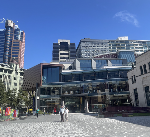

Indeed, some interesting planning choices made here! Never quite understood the logic behind the three-way division of the supermarket, as someone usually going in there wanting to buy items from each department. I guess commercial buyers are more likely to stick to just the one department on their spend-ups..
I agree with your comment on the success of the textured concrete panels at ground floor. ’80s axe and vegemite mural on one face, tactile texture on the other. Both present more engaging alternatives to what could have otherwise been completely blank facades.
One huge missed opportunity, in my view, is the decision to place the cafe in the produce department smack in the centre of that internal space. Shifting this out slightly to front College St could have presented a valuable addition to the lively, car-friendly College St cafe scene currently consisting of L’Affaire and Brooklyn.
How considerate of the building, though, not to block their sunlight!
I still find this development very odd. Aside from the issues with parking (entering and exiting on to 2 of the narrowest streets in Wellington, and causing traffic jams every weekend), it seems to deny any possibility to the casual pedestrian – which maybe made sense 20 years ago when it was first done, but makes absolutely no sense now that we have 10,000 people living in the inner city.
With regards to whether it should go up a floor or two – or not – it certainly does not look as though they have allowed for that possibility in the redevelopment. Low roof, no internal columns capable of taking new floors above – no chance of it going up.
Which is a nice change.
Don’t take your eye off the ball – there is still one part of the site they haven’t really touched yet…
I see that Moore Wilson’s received an Architecture award last night at the NZIA awards. Judges citation reads:
Athfield Architects Limited: Moore Wilson Fresh
“A client/architect association lasting over 40 years has resulted in a dynamic relationship between shopper, product and space. An informal street leads to a subtly detailed urban market with refreshing product organisation and display.”
Well done Aths…
I agree with Alan. The whole edifice is designed for the car, rather than for human beings. That’s great for cars. But for human beings (who, I am told, nowadays form a significant part of Wellington’s population), the result isn’t inviting.
All in all it’s very much a 1970s-style suburban design pattern of the type that the rest of the civilized world no longer builds, but which passes for cutting-edge here in NZ. Perhaps the architects will give themselves awards for it. But beyond our little island bubble this kind of thing would get laughed off the stage.
.