Monday morning: my mind mentioned monumental Mondrians.
Tuesday: thought that this told tales of tall towers.
Wednesday: was when we wondered where we were.
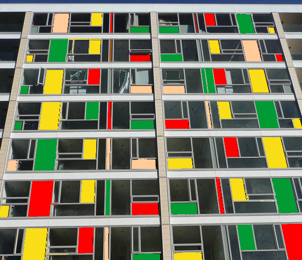
Today however, all was revealed. Closed my eyes for a second, took my mind off the ball, and with a start I find that the wraps have come off the Monument apartments in a most alluring manner. So: Architecture + and Stratum / CAS have done it again: completed a major new apartment building in the middle of a nasty recession. Although Monument is not quite finished yet, the east elevation unveiled just within the last week has shown us a bright new facade in welcome contrast to the boring black of the Hotel de Wheels just across de road.
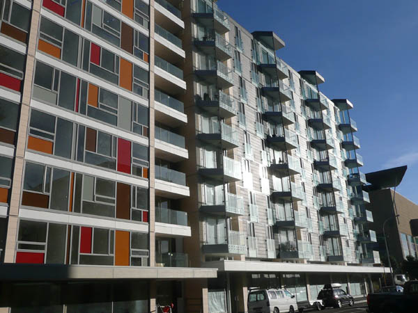
It’s interesting to compare the new Monument to its big brother Piermont just next door. While both buildings have completely crap websites that tell you nothing and just waste your time, if my memory serves me right there is also a large courtyard to the rear here, which links to the Piermont’s courtyard. Eventually, one day, if CAS get hold of the neighbouring sites, perhaps they’ll join them all together in a giant threesome or even foursome, back to back, courtyard fronting up against courtyard: true European style inner-city living on our doorstep at last. But sadly, with no plans available online, nor a working showroom open, there is little else we can show you inside at present. Maybe later.
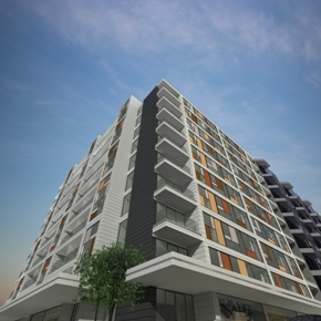
Rumoured to have plans for a large 4 Square store in the ground floor, in a valiant effort to take away the dominance of the New World just a block away, the cut and colour of the facade poses an interesting question or two: is the homage to Mondrianesqueness (to invent a suitable word) just an aesthetic affectation, or is there a more meaningful method behind the melange? And did the design team ever feel tempted, when they got word of their new tenant down below, to tweak the colour range just a little…?

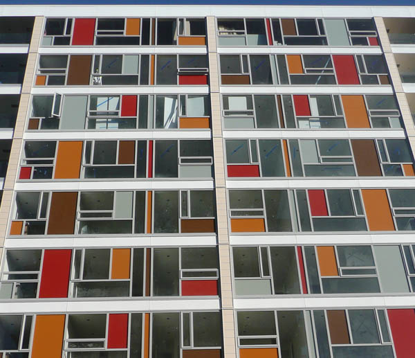
Update 17 Aug: Of course, I was just kidding with the picture up the top. Trying out the possibilities of a different, more corporate colour scheme. I’m sure that Arch + have never done this, and would never be so crass… … or would they? Here’s the real colour scheme below.


The new foursquare will be interesting, traditionally it runs a higher margin that the other foodstuffs brands, How far will people walk to save a few ( or more) cents on things like bread/milk/bikkies?
Not that Chaffers NW is the cheapest place in town, thou,
FS could do quite well out of museum traffic, but I think that the rebranded “Fix24” one block up on Tory should be worried.
There’s lots of people who drive their cars to New World and do a massive food shop. But also now a lot of inner city dwellers who walk to the supermarket and back with just a single bag or two, negotiating their way across the carpark and nearby roads. Given that there are going to be zero carparks for 4 square, what are they going to try and beat them on? Price? Service? Trolley design? Or just their iconic logo?
Forget the damn shop at the bottom guys, it’s the facade that I’m trying to figure out. I can understand the “random” placing of colour and the small slutty windows that run horizontally and vertically. But what I don’t get is the blanked off coloured window at eye height taking out your view of the harbour, while keeping a clear panel so that someone can look up your skirt! What’s the logic behind that?
The lot next to this (including where the electrcal wholesaler was and the empty car yard) is going to be a Woolworths supermarket.
Rumoured to have plans for a large 4 Square store in the ground floor, in a valiant effort to take away the dominance of the New World just a block away
Interesting that 4 Square and New World are both owned by Foodstuffs. I wouldn’t mind a metro supermarket down that end of town, but it would have to be closer to Courtenay Place and further from the New World to be worth my while.
Noooo….!!!!???? I thought that 4 Square was the one independent in the game. And I can’t believe that Woolworths will open next door. Its all going to retail crap !
You’re right (of course – i should know better than to contradict your knowledge of retail / music trivia):
I didn’t know, but have just found out, that Foodstuffs owns the following brands:
PAK’nSAVE
New World
Four Square
Write Price
Shoprite
On the Spot
Liquorland
Henry’s Beers Wines & Spirits
Duffy & Finns
and their brands:
Pams
Budget
Gilmours
Toops
………………….
while their opposition, Progressive, owns:
Woolworths
Countdown
Foodtown
and brands:
Signature
Home Brand
Select
Essentials
Progressive also runs the supervalue and fresh choice chains in the South Island.
For me, not enough time has passed for the retro-modernism of these windows not to evoke the real thing, aka the dreaded Pomare state housing unit http://images.trademe.co.nz/photoserver/tq/52/101089952.jpg
BTW are tenants in these apartment buildings in Wgtn allowed trees and plants on the balconies and terraces? Greenery could go a long long way towards assauging any uneasiness people having about living in such steel and glassness. I’m thinking of Spanish-speaking countries do this especially well – plenty of apartment dwellers have a almost whole garden on their deck.
JP
I don’t quite see the resemblance. Maybe if you squint really hard and take some magic pills.
regardless I can assure you that the irregular proportion of windows has a precedent far earlier that Pomare state housing (or any other architecture in NZ). Le Corbusier worked with a mixture of glazing proportions and sizing on various projects. He was not the only one, but one of many to research. Pomare is definitely not the REAL thing.
I suspect that the “mondrian” coloured glass, is also an attempt to link across to the
Milan Mrkusich work at Te papa
I’m very keen to have a look inside them and see how Mon compares with Pie. The facade is flatter and less intricate – does the same go for the internal planning also?
I don’t think the apartments are that bad as far as apartments go but their website is (IMHO) from the finger-down-the-throat school of design.
(www.monumentapartments.co.nz)
Speaking of websites – it is fantastic to see that architecture + have at last made themselves a website – or updated their old one. It used to be embarrassing that so many Wellington architects can not be bothered to complete their web presence – CCM has one that is always ‘under construction’ and Athfield really don’t have a functioning website at all. What gives? Why so sullen on the technology front? Why not just employ a student – they can do these things in their sleep nowadays.
The new facade reminds me of the fronting of Te Papa… in this respect it shows a touch of continuity in the area, which was slowly being overgrown with giant black apartment “blocks”
of course, the facade also reminds me of something architects often seem to forget in their rush to get projects out there… today’s high fashion is tomorrow’s garish and nobody wants to live in an ugly apartment block given the choice… they will devalue far quicker than something with a little more of a classic look. (that is of course, until the apartment is 60 years old and retro cool, then everyone will want in simply for the cool factor)